Table of Contents
To be updated - R7.10 - F8674 - School Years Section for Responsible School Records
PASIprep Combobox / Dropdown
This is a Widget for the PASIprep UI Guidelines.
For input values where user have a list of possible options to select from (e.g. selecting an Authority, or selecting from a list of code values), there are three possible input controls available.
Select Control
-
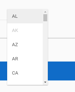
- User have limited typing capability in this control to filter out the options - generally they must scroll through the list to select the appropriate options.
- This is the preferred control for fields where user are presented with a list of options and must select one of the options, or when user can select multiple options
- If the Select dropdown is used for an optional field, an empty option should always be included in the control to allow user to clear a field. This empty option should always be displayed as the first option in the control.

Multi-Select Control
- The design of the screen may require a standard Select control to allow multiple selections. Please follow the Angular's standard for multi-select.
Select Control with Autocomplete
- See (https://material.angularjs.org/latest/demo/autocomplete - with validation on the option selected)
- By default the control should be blank - this allows the dropdown list to be shown as soon as user puts focus on the control
- Used for Organization (Authority/School selection)
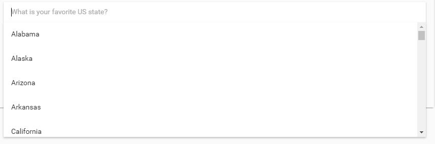
- User can type and filter out the list of options available; however:
- If the field is blank, when the field is on focus, the full list of options should be shown in a dropdown
- Once the field is not in focus, when user brings it back in focus (e.g. by clicking on it or by tabbing into it), the text in the field should be selected by default
- User can potentially enter a 'bad' value that doesn't match any of the valid options - the screen must have proper validation to ensure 'bad' options are not accepted.
- This control is selected in favor of the Select control when there are many options for user to choose from, where the filtering makes it easier for user to find one particular option.
- In a search form/criteria scenario, “All”/“Any” option should be represented as “–All {object name}–” or “–Any {object name}–” (e.g. “–All Schools–”). It should be the first option on the list.


Autocomplete
- See Angular spec: (https://material.angularjs.org/latest/demo/autocomplete)
- Similar to the Select Control with Autocomplete; however, user are free to enter a value that doesn't match any of the autocomplete suggested options.
- This is used mainly for text fields where user can enter any text, but the system has a list of 'recommended' texts that user can use as well.
Clearing Selection that is no longer valid
- When user is editing a record that contains a selected value in a dropdown that's no longer valid (e.g. a code value that has been saved for a record but has since then expired), by default the dropdown control will blank out the selection to force user to select a new value.
Displaying Code Values
- When the list of options are from code values, the short description of Code Value must be visible, either just as “{Short Description}” or {Code} - {Short Description}“
- Generally the first format is sufficient but the 2nd option is favored if:
- the Code is drastically different than the description or has a meaning to a user (e.g. Grants Program Codes are numeric codes that are well known to users and thus the 2nd format is preferred to show the code to the user)
- The code text is used somewhere else in PASIprep for the same data element (e.g. in a grid of the same record type), so the user can make the link between the code text and the description easier across screen.
- When the record the user is editing is associated to a School Year, the dropdown of Code Values should filter based on which code values are active on the School Year selected.
- If the user has not selected the School Year yet, then all code values (regardless of its effective School Year range) will be displayed; this means if user selected a value then selected a School Year where that value is inactive, the selection will be clear as that value will be filtered out of the dropdown list.
Displaying School Years
- When a Dropdown control is used for user to enter the School Year for:
- School Enrolment related records:
- If data retrieval is limited to 'active' records only then the dropdown should contain all School Years of data that can be retrieved.
- If data is not limited then the dropdown should contain all Accepted School Years starting from 1990
- Options are sorted in descending order (recent→oldest), defaulted to the Current School Year (use the latest SY if there are more than one)
- Marks related (Course Enrolments, Evaluated Marks, Exam Marks, Official Marks) records:
- If data retrieval is limited to 'active' records only then the dropdown should contain all School Years of data that can be retrieved.
- If data is not limited then the dropdown should contain all Accepted School Years
- Options are sorted in descending order (recent→oldest), defaulted to the Current School Year (use the latest SY if there are more than one)
Filtering Options based on Permission
If user does not have sufficient permission to select an option in the dropdown, the option should be hidden.
Note: this visibility rule should be kept simple (based strictly on user's PASIprep permission). If it's conditional based on other data values on the record (e.g. “if user select the record's Status to ABC, they must have Level_XX permission to select option XYZ) then that should be enforced with a validation rule and not by filtering the option off the list.