myPass Expander Guidelines
An expander should be utilize when the information to be displayed can be summarized in a few lines and additional details are provided on request. This is important in smaller resolutions to best utilize the screen real estate. Refer to the myPass Widgets and UI Patterns for other myPass User Interface Guidelines.
An expander should use (+) and (-) toggle buttons to denote its state, and to allow user to toggle the expanded/collapsed states. The button should always align left; if there is text that accompanies the expander button, the text should also be clickable to allow user to toggle the state. Expanders should be collapsed by default unless stated otherwise.
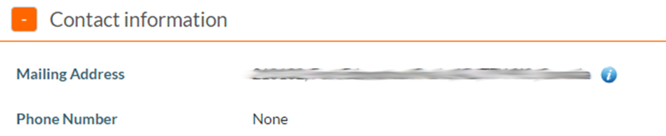
- Expanded example
- Collapsed example


Style
- Expander control button color: Complementary Color 1