Table of Contents
myPass Form Guidelines
A form layout is used to display field values of a record. Refer to the myPass Widgets and UI Patterns for other myPass User Interface Guidelines.
Form references:
Mockup – Large Resolution

- A form generally have left-aligned labels followed by the value. If it’s read-only, the value is simply a text string (as shown in mockup); otherwise it is an input field such as a text box.
- Labels should have a defined maximum width to avoid it to become too far apart from the values on large resolution
- Labels should left-align with each other, and similarly for values. Each label-value pair should be top-aligned if one of them extends beyond a single row (e.g. “Alias” on the mockup has values that are multi-row, and the label aligns on the top with the first row of the value)
- Labels generally will not end with a punctuation (no colons, question marks, etc.)
Mockup – Small Resolution

- Same look and feel as the Large Resolution – except the label is now top-aligned
Styles
- Field Label - 1.0em (12pt) Ultra Bold (900), Primary Color 2
- Read only field value font – same as Body Text
- Text input field value font - same as Body Text
- Hint text – same as Sub-Text
Field Labels
- Field labels should be clear, concise and consistent across forms
- The HTML <label/> element should be used for accessibility and to allow user to click on the label text to toggle the control
- Mark optional fields with the text “(Optional)” in subtext font

- This assumes myPass forms will contain mostly (if not all) required fields; optional fields should be avoided as much as possible to respect smaller screen resolutions
- If a use case does arise where a form does have more optional field than required, mark the required field instead with the text “(Required)” in subtext font.
Hint / Additional Information Messages
Depending on the situation, there are four styles of hint/informational messages that could be used on a form to provide user with additional information on a field.
- Directly below the label
- Used for important messages that needs to be on screen at all times
- Font Style: Bolded Sub-Text

- Directly below the field
- Used for format hints, or shorter messages that are important
- Font Style: Body Text

- Appended to the end of the field as an info tooltip
- Used for additional information that would aid user in understanding the field; however the information is not prominent enough to warrant the need to place the information on screen.

- The tooltip will show on click or hover.

- Appended below the field as a link tooltip
- Used when the information presented is only applicable to certain scenario, hence text needs to be provided to let user know when they need to look at the information.

- On click, the tooltip will show:

Blank Field Values
- For Read-Only Field Values
- If the value is blank, by default, display blank
- In Public Mode, it may be beneficial to hide the field when it is blank to minimize clutter for public uses (e.g. Students). This will need to be defined for each form design.
- In Administrative Mode, by default the field should still be visible even if it blank
Input Fields and Elements
- Input element general styles and behavior:
- Elements (input text boxes, radio buttons, checkboxes) should have a width/height that is touch friendly (45px minimum for finger input, 72px minimum if thumb input expected)
- Input fields should have a width that comfortably fits the expected length of the value.
- Required input fields should have the following attribute targeted for screen reader:
aria-required="true"
- This is part of the ARIA specification and provides indication to screen readers which fields are required. This URL provides some background information: [https://developer.mozilla.org/en-US/docs/Web/Accessibility/ARIA
- Text input / text area field behavior:
- If possible, prevent user from entering text that is not valid, e.g.
- Prevent user from entering more characters than allowed for the field
- Prevent user from entering invalid characters (e.g. entering non simple string characters, or entering a letter for a numeric value, etc.)
- Trailing/Leading/Consecutive white spaces can be entered by the user, but they should be automatically trimmed on form Submission if it is not allowed for the field.
- If user must enter a value in a specified format, provide a format hint. The format hint can be either written as a format string if it is easy to interpret (e.g. for dates, “YYYY/MM/DD” is a commonly understood notation), or an example can be provided (e.g. for postal code, the hint “Example: A0A 0A0” can be used)

- If possible, be as forgiving as possible for entry errors when the user is expected to enter fields in a certain format.
- E.g. if the expected ASN format is “xxxx-xxxx-x”, if user forgets the hyphen and entered “xxxxxxxxx”, either insert the hyphen for the user, or accept the value without hyphens.
- Placeholder text in textbox/text areas are discouraged as they suggest to user that the field has already been filled in
- Radio buttons and checkboxes
- For Radio Buttons or Checkboxes on a field to indicate multiple options, the options should be vertically stacked and clearly separated by rows. Clicking on the button or the text should select the option, and the row should be highlighted in Primary Color #5 to indicate the selection
- E.g. of radio button options (desired touch target area highlighted)

Field Visibility
- Ideally, a form should be short enough to fit all fields on a large resolution screen comfortably; if a form is long, it should be broken down into separate pages or sections.
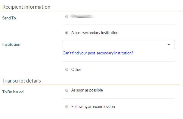
- Fields should always be visible by default to set user’s expectation on what they need to enter; however, on forms where what fields are required is dependent on the user’s action, these dependent fields should be hidden by default and exposed only when user has completed the appropriate action.
- E.g. the following form has different field requirements depending on the user’s radio button selection.
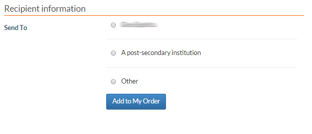
- Once user selects the option, the appropriate fields loads


Field Validation (Client Side)
Client side validation (missing required fields, format error, out of range) should be utilized to inform user of form field errors before the request gets submitted. Ideally, client side validation should happen either immediately after user entered a value on a field and moved away from the field (preferred), OR after user hit the Submit button (and before the request is sent to the server).
- All fields should be validated to the best of the client side’s capability to ensure the value entered by the user will not fail schema validation (e.g. bad data type) or cause database errors (e.g. max length exceeded, foreign key constraints, etc.) during saves.
This image shows an example of a part of a form that is asking for two attributes. In this example, the Email Address data element has a client side validation to check the email address format.

The image shows how myPass will display a validation error that was detected clients side (actual implementation may vary – the main requirement is that the field is clearly highlighted in an Error font & background shade, and a clear message is provided to inform the user what the problem is):
Below is some common error messages:
| Error Type | Message |
|---|---|
| User did not enter a required field | This field is required. |
| User entered an incorrect format for a field | Please provide a {field} in the format: {format}. e.g. “Please provide a date in the format: MM/DD/YYYY” e.g. “Please provide an email in the format: @._” e.g. “Please provide a phone in the format: (xxx) xxx-xxxx” Note: When possible, be forgiving on the format; e.g. let user enter phone number as xxx-xxxxxxx or xxxxxxxxxxx or (xxx) xxx-xxxx. |
| User entered the wrong data type (e.g. they enter an alphabetical string instead of a number) | Please enter a {type}. e.g. “Please enter a number” e.g. “Please enter a date” |
| User entered a value out of range | Please enter a value between {min} and {max}. |
| User enters an invalid date range | Please enter a start date that is earlier than the end date. |
Leaving the Form
If user attempts to leave the form without saving (e.g. by closing the browser, or entering a new URL, etc.), a confirmation dialog with 2 options (a Yes option and a No option) will be shown first; clicking the Yes option closes the dialog and user will proceed to leave the page with their progress abandoned; clicking the No option closes the dialog with no change.
Form Submission
Preventing double-submission
To prevent a form from being submitted more than once in error, after a user click on a submission button on a form, all submission buttons currently presented on screen should be disabled (either by disabling the buttons (preferred) or taking user to an interim 'loading' state where no other submissions can be made). This will prevent user from performing any other submission until the current submission has been completed.
Once the submission is completed (regardless of whether it was a successful submission, or an error has occurred), user should be free to perform submissions/actions again.
Page Form Button/Submit Button Placement
Buttons on html forms on pages should be left aligned to the input elements, with the primary button being the left-most button.
There are some rare exceptions to the primary button being the left most buttons, e.g. [Yes]/[No] buttons where the primary button may be [No], or [Back]/[Next] buttons where the primary button is [Next]. These exceptions should only occur if switching the order breaks the conventional reading order that user is familiar with (e.g. user generally expects to see [Back] before [Next], [OK] before [Cancel], [Yes] before [No], etc)

Dialog Form Button Placement
Buttons on html forms on dialog boxes should be right aligned of the form’s width, with the primary button being the left-most button.

If the dialog box is wide, the form’s width should be relatively contained to avoid too much whitespace between the buttons and the field elements.

Button Styles
The button that represents the primary action should be styled as a Bootstrap Primary button and the other buttons should be styled as Default.
Capitalization of Button Labels
The button labels should be written, whenever possible, as an action and using “title case”. E.g “Delete the Connection”.
http://www.grammar-monster.com/lessons/capital_letters_title_case.htm
Submission messages
When a user attempts to save a form that PASI Core indicates is an Empty Update then display a Warning Message with the following text:
English: "There was nothing to update since you did not change any of the values."
Note: This could be done as a client side validation or as a server side validation. Client side is preferred. When a user attempts to save a form that PASI Core indicates is a successful update then display a Success Message with the following text:
English: "Save successful."
Messages should be displayed in the manner described in Error / Message placements
As a general guideline, a success, failure or warning message should be displayed to user when they submit a form so that the user is aware of what happened with the submission.