Table of Contents
myPass Grid Guidelines
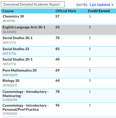
Used to display a list of records when multiple columns are of interest to user for comparison and review purposes. To respect smaller resolutions, grids with a lot of columns should be avoided – a master-detail grid or a list with drilldown screens will scale better for all resolutions. Refer to the myPass Widgets and UI Patterns for other myPass User Interface Guidelines.
Mockup – Large Resolution
Top right corner of the grid may contains filter/find/sort/view functions presented as buttons or menus. Top left corner of the grid may contain functions that is applicable to data on the grid, presented as buttons or menus.
Mockup – Small Resolution
Similar to large resolution – to reduce to smaller resolutions, either columns have to start wrapping texts, or some columns are hidden by default that would not be shown unless user requests it (either in a row that can be expanded to show more details, or as a new page). Top right corner of the grid may contains filter/find/sort/view functions. If the large resolution version utilizes buttons for these functions, they can be collapsed into a menu if it does not fit on a small screen. Top left corner of the grid may contain functions that is applicable to data on the grid. If the large resolution version utilizes buttons for these functions, they can be collapsed into a menu if it does not fit on a small screen.
The mockup below shows a grid on small resolution with grouping rows. An Arrow icon [>] is used to indicate that user can drill into more details on click.
Style
- Column Header (0.83em (10pt) Bold, Grey Color 2)
- Column Header text may wrap
- Column Header Color: Primary Color 4
- Alternating Row Colors: #ffffff and Primary Color 5
- Row Separator Color: Primary Color 4
- No Vertical Separator (Ensure there are sufficient whitespaces between columns)
- Selected row color: Grey Color 5


