Table of Contents
myPass Master Detail Grid Guidelines
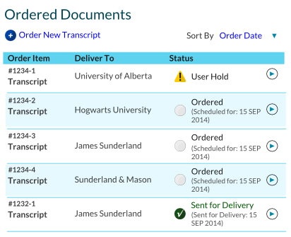
An advanced version of the grid, the master-detail grid allows user to view more information on request. It is a grid with an extra detail panel that is used to display extra information. Refer to the myPass Widgets and UI Patterns for other myPass User Interface Guidelines.
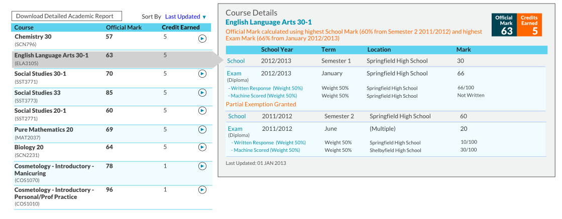
Mockup – Large Resolution
When user clicks on a row on the left, the right detail panel updates to show details relevant to the selected row.
On page load, the first row is selected by default.
The right panel should always be visible to the user regardless of where they have scrolled to on the master list.
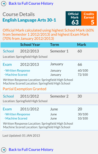
Mockup – Small Resolution
Once the resolution is too small to support side-by-side panels, the detail panel will appear as a new view instead. Master view:
On click it will load the detail panel that replaces the master grid. User can use the provided Back button to return to master grid:
Style
The Master Grid has the same style as the standard Grid. Detail Panel style
- Background Color: Grey Color 5
- Border Color: Grey Color 1


