myPass Overlay Dialog Guidelines
Overlay dialog is used for quickly displaying information or action to user without removing them from the context of the page they are viewing. Refer to the myPass Widgets and UI Patterns for other myPass User Interface Guidelines.
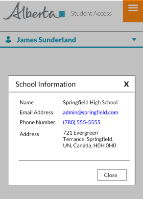
The dialog needs to be responsive – i.e. it should scale accordingly to the resolution
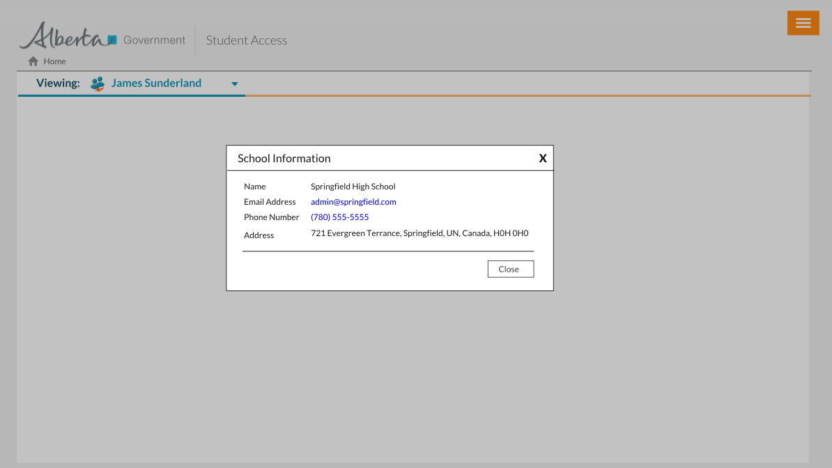
Mockup – Large Resolution
- The dialog should be styled in a manner where user can easily distinguish that they are in a dialog mode.
- A close button is available on the right top corner
- Content is centered on screen – ensure when user switches orientation (e.g. portrait to landscape and vice versa) that the popup reposition itself properly so that it is still visible to user
- Always provide a form of [Close] button as part of the content to allow user to close the dialog (label of the button may vary, e.g. ‘Cancel’, ‘No’, depending on the content)


