Table of Contents
myPass Wizard Guidelines
A wizard is used to guide user to perform a complex or long task with simple steps. Refer to the myPass Widgets and UI Patterns for other myPass User Interface Guidelines.
Mockup – Large Resolution
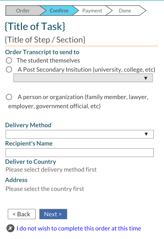
- The wizard header consist of the wizard title, the step title, and the progress bar
- The Wizard title shows the title of the task; it is constant in each step and it should describe to the user the task they are performing (e.g. “New Transcript Order”)
- The step/section title shows a description of the current step (e.g. “Enter shipping information”) to allow user to identify what they have to do for the step to proceed
- Generally there should only be one section per page; however if the form has logically grouping of fields, it may lead to multiple section per page. Each section will have its own section title.
- The progress bar indicates how many items the user have to perform to complete the task
- Each item should have a short (one word) description
- The current item is highlighted and uses the heavy emphasis font
- The completed items are shaded differently than the incomplete items.
- The progress bar is not clickable.
- In general, each item refers to a single step/screen the user goes through; however there can be exception cases where a single item on the progress bar consist of multiple steps/screens.
- The final item should be named “Done”
- User navigates through the wizard using the controls at the bottom of the wizard (see section Navigation & Submission)
Mockup – Small Resolution
- The wizard header wraps on lower resolution so that the progress bar will slide above the title of the task (the progress bar may wrap as well if needed)
General Guidelines
- Since wizard is generally made up of forms, all Form guidelines applies to wizards as well when user is required to perform data entry.
- When user returns to a previous step, any information they have entered should be preserved on screen as much as possible
- If the student connection selector is available, and user decides to change student in the middle of the wizard, they will be first asked via a confirmation (Yes/No) dialog titled “Change Student” to confirm if they wish to quit the task with the following message (unless otherwise specified in the design for the wizard):
Are you sure you would like to change to another student? All the progress you have made so far for this task will be lost, and you will have to re-start the task from the beginning.
- If user selects [Yes], the new student is selected and user returns to the 1st step of the wizard
- If user selects [No], the student selection does not change and user stays in the wizard.
- “There should generally be a “Done” step at the end that confirms successful save and completion of the task
- User should be provided with links on the “Done” step to go to the next logical screen(s), which generally is either:
- The Home page, or
- Back to the start of the wizard to perform the task again, or
- The page where they can see what they have done (e.g. for a “New Transcript Order” wizard, when a user has completed the wizard they probably would like to go to “View Orders” to see the new order that has been created)
- It may be reasonable to present more than one option for the user on where to go to next. The more prominent option (if any) should be styled as the default button
- There should be a final confirmation step (generally before the “Done” step) that allows user to review all the information they have entered before they commit and finish the task.
- During the wizard process, user should not have to return to a previous step to review what they have entered; if the previous step contains information that user may need in the current step, then it should be presented in the current step
- E.g. if in step 2 user is asked to pay $10.00, then in step 3 user is asked to submit a payment, step 3 should contain the value “$10.00” on screen so that user don’t have to return to step 2 if they cannot recall or want to confirm the payment amount.
Navigation & Submission
- User navigates through the wizard using the controls at the bottom of the wizard
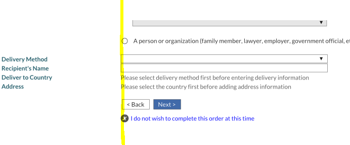
- The navigation buttons should align with the input controls on screen (as highlighted below in yellow)
- The [< Back] button allows user to return to the previous screen/step
- It is visible only if there is a previous screen/step to return to
- The [Next >] button allows user to proceed in the wizard
- If is visible only if there is a next screen/step to go to
- It is the default button to the form
- If it is the last submit button user can click on in the wizard (generally on the screen before the “Done” step), then it should be labeled [Submit] (or an equivalent label that indicates to the user that once it’s clicked the task would be saved and completed)
- A cancel link is presented below the Next and Back button that allows user to quit the wizard completely (example: the [I do not wish to complete this order at this time] link in the screenshot above). Clicking on it brings a confirmation dialog with 2 options (a Yes option and a No option):
- If user click on the Yes option, they are taken out of the wizard with no change submitted. They will be taken to the screen that they were on before they entered the wizard, unless otherwise specified in the design of the wizard.
- If user click on the No option, dialog closes and they stay on the wizard.
Style
- Title of task – heading 1 font
- Title of step/section – heading 2 font
- Progress bar – subtext font size, body text font colour
- [< Back] button – bootstrap default button
- [Next >] (or [Submit]) button – bootstrap primary button


