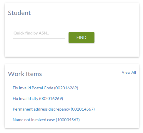
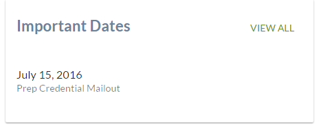
PASIprep Card Group
This is a UI Pattern for the PASIprep UI Guidelines used to:
- Group content together on a dashboard/landing page type screens
- Summarize information that are most relevant to the user when viewing a particular page (e.g when viewing a screen with a list of Student’s names, the preferred name can be highlighted to the user by placing it in a Card).
- Display single fields or 'short' content where using just a PASIprep Business Object Grid would unnecessary overload the screen.
Display Guidelines
The design of the screen should specify how cards should be laid out (if there are multiple cards) in a 'grid' fashion, and the relative widths of each column (e.g. “Four cards in a 2 column layout where each column takes 50% of the available width”)
- As cards are used to highlight information or isolate shorter content to its own group, they should used sparingly on a page; too many cards on a screen will de-emphasize its value on screen.
- For a consistent look-and-feel, if there are multiple cards in a row, they should all have the same height (even if one card has longer content than others)
A Card has the following components:
- Card title (Optional) – describes the content of the card. Should be displayed in Heading 4 font.
- Content - while there are no restriction on how the content can be laid out the Value List pattern is recommended when the content is mainly field/value pairs.
If required, action links (such as Edit) can be provided in the:


