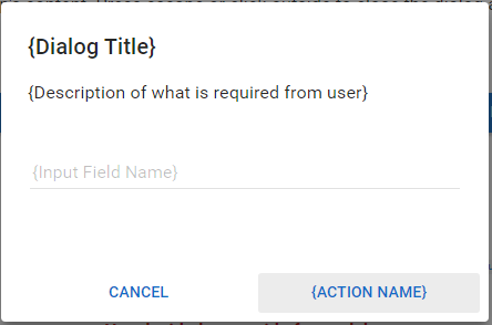
PASIprep Dialog - Prompt
This is a Dialog Template for the PASIprep UI Guidelines.
This dialog should be used when user is performing an action but it requires an additional input from the user before the action can be performed. Since the number of input is low (usually one), a dialog is used in favor of a screen to provide a quicker/lighter experience for the user.
Layout of Prompt Dialogs
Prompt dialogs should mimic the layout of the “Prompt Dialog” in the Angular Material dialog demo:
The single input field in the prompt dialog should use the same field/value format used in PASIprep Field Value List / Form. Since this is a dialog, there is only 1 column (i.e. each field/value pair will be on its own line)
Note: This type of dialog cannot be dismissed by clicking outside of the dialog.
Action Buttons
Action buttons should be displayed in the persistent footer bar present in every dialog.
- [Cancel] should allow user to close the dialog with no further action.
- [{Action Name]} should allow user to proceed with the action. The action should use the primary button color.
- If the input field in the dialog is a required field, validation will be performed first to ensure user has entered the field before they proceed.

