Table of Contents
PASIprep Field Value List / Form
This is an UI Pattern for the PASIprep UI Guidelines used to display a list of PASIprep Field/Value Pairs on screen.
Field/Value Groupings and Layout
Field/Value Pairs in a Field/Value List should be grouped in a logical manner which will drive how it is laid out on screen.
Field/Value Grouping
Groups will help define the vertical 'breaks' in the list of Field/Value pairs. The design of each screen will specify the groups of Field/Values and as needed the name of the grouping to be displayed on screen. It is possible for a list to only have a single group of fields (which indicates there are no vertical 'breaks' - the fields will span horizontally as much as possible)
When required, a group name will be presented in heading 3 font. The first group of the list generally would not require a group title.

Field/Value Layout
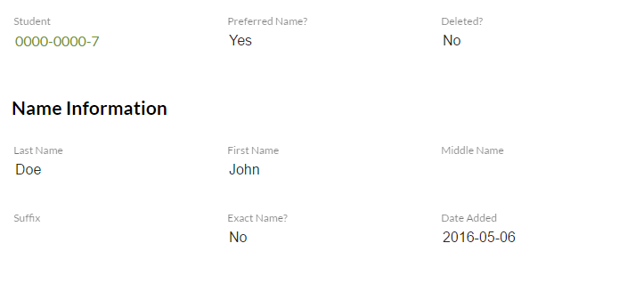
Within each field/value grouping, the Field/Value list is laid out in a 6 columns 'grid', with each column taking 1/6 of the available screen width.
- A column span of 2 is preferred for most field/value pair, unless it is expected to be short (e.g. boolean fields) or long (e.g. long text descriptions).
- Field and Value (i.e. Labels and data values) should wrap as needed if the column width is too small.
- The design for the screen will specify the column span for each Field/Value pair
The 6 columns layout will only be supported up to the 'sm' resolution defined in Angular Material (https://material.angularjs.org/latest/layout/options), which is minimum 960px width and above. If the resolution goes smaller than 960px, all field/value pairs will be displayed in a single column (note since this is not a resolution PASIprep supports, PASIprep is not guaranteed to function properly in this resolution).
Grid Layout Example
For example, if a Field/Value List is used to display 6 fields:
- Name (column span = 4)
- Date of Birth (column span = 2)
- Address (column span = 6)
- Phone Number (column span = 2)
- Email (column span = 2)
- Comments (column span = 6)
and the following groupings are defined:
| Group | Fields |
|---|---|
| 1 | Name, Date of Birth |
| 2 | Address, Phone Number, Email |
| 3 | Comments |
Then the fields will be displayed in the following manner (note: each column should be fixed width on screen):
| 1 | 2 | 3 | 4 | 5 | 6 |
| Name | Date of Birth | ||||
| Address | |||||
| Phone Number | {nothing} | {nothing} | |||
| Comments | |||||
If the resolution becomes too small to fit the column view, the screen will push all fields into a single column; thus, the fields in the example above will be displayed in the following manner:
| Name |
| Date of Birth |
| Address |
| Phone Number |
| Comments |
Form Field Layouts between View and Add/Edit screens
The PASIprep View Item Template and PASIprep Add Item Template/PASIprep Edit Item Template screens for the same Business Object Type should retain the same sort order and grouping as much as possible to establish consistent layout of data to the user. Hence, when deciding on sort orders and groupings, the fields should be ordered in a manner that is logical for both data entry and data review.
However, often a View of the record will present more fields (e.g calculated fields, audit information fields, or specially formatted fields such as addresses) than the Add or Edit screen of the same record, hence it is accepted that the field ordering/grouping may not match completely. The following are some guidelines to address the possible differences:
- If a field is never entered/modified by the user (e.g. the Last Updated On field), preferably they should not be on the Add/Edit version of the screen. If possible, place these read-only fields in its own group or sorted at the end of a group so that hiding them will not impact the layout of the data too much.
- Sometimes during Add/Edit, there is a need to show some read-only fields that helps user identify what they are editing - in such scenario the readonly fields should be placed in the beginning or the end to keep actual editable fields grouped closer together.
- If a field is conditionally editable by the user, it should always be shown on screen (so that its placement is consistent on screen regardless of the condition), but disabled (with a hyphen ('-') as a value if it's blank). If needed, an input hint/tooltip can be used to explain to the user why the field is not editable.
Editable Form Guidelines
If the Field/Values are editable, the following form guidelines should be followed:
- On page load, the first editable field should be in focus by default.
- Tab order should be observed and should go through each group/field sequentially (i.e. within a group user should be able to tab through the fields sequentially, and when they reach the end of the group, they will tab to the next group's first field)
- When a user's focus is on a field in the form hitting [Enter] on the keyboard should trigger the Primary Action of the form automatically (e.g. Save). The exception to this behaviour is when the focused field has some other behaviour tied to the enter key such as a text area, or while doing selection on a drop-down.

