Table of Contents
PASIprep Dialog - Alert/Confirmation/Information
This is a Dialog Template for the PASIprep UI Guidelines.
A dialog should be used for:
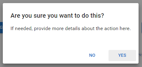
- Confirmation Dialog. Typically a “Yes/No” question to a user.
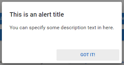
- Alert Dialog. Typically contains a simple message and has a single button.
A more complicated usage would be for the dialog to display more complicated information:
- Displaying additional help information / descriptions that user occasionally needs but is not presented on screen to conserve screen real estate.
- e.g. When user sees an “order item status” on screen, a link can be provided that brings up information on a dialog of what possible statuses may appear for an order item. This information, while useful, does not have to be consistently on screen, so a link to a dialog can be used instead.
- Displaying callout/supplementary information or functions when user is on an PASIprep Add Item Template or PASIprep Edit Item Template or
- e.g. when user is asked to view information on a course code, they may need to look up details on the course code - a dialog should be provided for a user so they can view details without navigating the user away
Button Style
Buttons should use the default Material Angular button style for alert, confirmation and information dialogs.
Layout of Alert/Information Dialogs
Alert/Information dialogs should mimic the layout of the “Alert Dialog” in the Angular Material dialog demo. User can close the dialog by clicking the single button.
Alert Action Buttons
Action buttons should be displayed in the persistent footer bar present in every dialog.
- Single submit button should be shown as a primary button.
Note: While this type of dialog by default (in Angular) can be dismissed by clicking outside of the dialog, it should be turned off in PASIprep 2.0.
Layout of Confirmation Dialogs
Confirmation dialog should mimic the layout of the Confirm dialog for angular: https://material.angularjs.org/latest/demo/dialog
Note: This type of dialog cannot be dismissed by clicking outside of the dialog.
This dialog may include 1-2 value pair to accept simple user entry required to perform the action. This is similar to the PASIprep Dialog - Prompt.
Action Buttons
Action buttons should be displayed in the persistent footer bar present in every dialog.
- Most common / default submit button should be the rightmost button; secondary action(s) are presented to the left of the default submit button.
- “Supplementary” actions that are neither default or secondary submit buttons are left aligned in the footer bar.
- Supplementary actions are not directly related to the main 'purpose' of the dialog, but may be present in some situations when user may choose to not act on neither the primary or secondary action choices yet until they have performed some other supplementary actions.


