Table of Contents
PASIprep List Items Template
This document describes the template & patterns for a “List” page in PASIprep for the PASIprep Page Layout Guidelines.
A “List” page's main function is to allow user to search and view a list of records of a specific Business Object/data type in a grid. Depending on what is being viewed, user may have the option to perform certain bulk operations on the records, or select a single record to view, or add a new record.
Page Content
Template Elements & Guidelines
| Template Elements | Options | Display Rules | Design Guidelines | Required Element? |
|---|---|---|---|---|
| Page Title | Specified in Design | See PASIprep Page Layout Guidelines | The Page title of a List Items page should generally take the format of “List XXXXXX”. | Yes |
| Browser Title | Defaults to the same as the Page Title | - | - | Yes |
| Identifier subtitle | Specified in Design | Displayed in the same area as a the Student Identifier Subtitle) | Explains to the user what they are searching for on this screen and what results can be expected. | Yes |
| Context Bar | See Context Bar Elements & Guidelines | Yes if user can enter search criteria | ||
| Grid Action Menu | See Grid Action Menu Items | Yes if there are actions user can perform on the grid | ||
| Full Screen Option | Required | See PASIprep Business Object Grid | N/A | Yes |
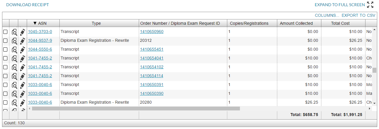
| Search Result Grid | See Search Result Grid Elements & Guidelines | Yes | ||
Context Bar Elements & Guidelines
The Context Bar allows user to view, add and edit the selection criteria that makes up the Context of the screen.
- The Context Bar sits immediately below the Page Title Header
- It can be expanded or collapsed using the expander on the top right corner (labeled “View/Edit Criteria” when collapsed and “Hide Criteria” when expanded).
- The Context Bar consists of Search Criteria Fields (when it is expanded) and Search Criteria Tags when it is collapsed.
- The List screen always loads with the Context Bar is expanded by default to show the Search Criteria Fields
- This will force the user to enter some criteria and execute a search before results will be shown on the Search Result grid.
- Users should be able to 'bookmark' search criteria they have entered so they can return to the screen at a later time with all the search criteria restored in the Context Bar and the search re-executed on page load with the restored search criteria.
- In the user's browser history, only the last search should be retained.
- For example, a user:
- Goes to the landing page of PASIprep
- Navigates to the “List Diploma Exam Registrations” screen, enters an Authority, a School, and a School Year, and performs the search
- Adds Exam Session as another criteria and performs the search again
- Views a specific Registration screen
- Hits the browser's back button to return to List Diploma Exam Registrations. The search with Authority, a School, a School Year and Exam Session will be restored (the last search the user executed)
- Hits the browser's back button to return to the landing page (since all other previous searches were not preserved)
- In this example, the user could have:
- bookmarked the page after step (2) which would allow them to return to the page with the search executed on page load for the Authority, School, and School Year they had selected.
- bookmarked the page after step (3) which would allow them to return to the page with the search executed on page load for the Exam Session, Authority, School, and School Year they had selected.
| Template Elements | Options | Display Rules | Design Guidelines | Required Element? |
|---|---|---|---|---|
| Search Criteria Form | Layout specified in design | Shown as PASIprep Field Value List / Form |
| Yes |
| Search Criteria Fields (used in Search Criteria Form) | Fields specified in design | Shown as PASIprep Field/Value Pair |
| Yes |
Search Criteria Form
Clicking/tapping [Edit Criteria] that sits on the corner of the context bar expands the Context Bar to reveal the search criteria form that lists all the search criteria relevant to the Business Object/Data Type that the user is currently viewing.
- Each search criteria is presented as a field/value pair; the content should be structured as a Value list and follows the standard of that pattern.
- If a field already has a criteria selected, its value will be pre-populated here and user can edit it as needed.
- The user can enter one or more criteria in this form and click [Search] to add the criteria to the context bar (which refreshes the grid to only show records that match the criteria)
- User can close the form without changing the criteria by clicking [Hide Criteria].
- User can clear all criteria by clicking [Clear All] which clears all search criteria and refreshes the grid. Note that if there are required fields in the search, this action clears the required fields as well (which results in the clearing of the search result grid as required fields are not entered)
- If there are multiple criteria in the Context Bar, they are treated as logical conjunctions.
Search Criteria Tags
A tag is used to display a single selection criteria in the Context Bar. Angular's Chips (https://material.angularjs.org/latest/demo/chips) is used to style the tag.

A tag will appear in the Context Bar for a selection criteria if the user has selected a displayable value. A value is not displayable if it is:
- null
- false (for a checkbox)
If the value name is too long (25+ characters), it will be truncated with an ellipsis. User can click/tap on the value and a tooltip will appear showing the full value string. If there are multiple criteria and it does not fit in one line, the tags will wrap to fit the screen as needed.
If user clicks on the [x] button, this will remove the search criteria and re-execute the search:
- If the criteria that was removed was a required field, this will cause the Search Criteria Form to expand so user can see the validation error that they have removed a required field (causing the search results to clear)
- The [x] button will be disabled while search requests are running to avoid re-triggering a search while one is already running, and to be consistent with Button/Function Link Guidelines.
Search Results Grid
The Search Results grid shows the records that satisfy the criteria defined in the Context; the grid follows the same standard as the PASIprep Business Object Grid. If the user has not yet entered all required search criteria, or has not yet executed a search, the search results grid is not displayed.
Grid Action Menu
If there are actions available to user that they can perform on records in the grid, the actions should be presented the in the Grid Action Menu Bar.
- If the action requires the user to select one or more records in the grid, the grid should be made selectable.
- Allowing bulk select is preferred to allow user to perform actions in bulk.
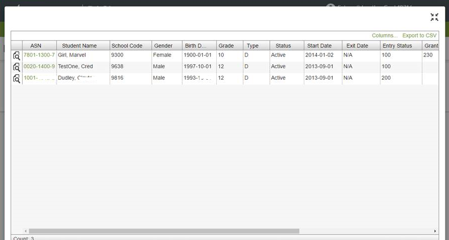
Full Screen Mode
The user can expand the search result grid into a full screen mode by clicking the full screen toggle button in Grid Action Menu.

In full screen mode, the Grid and its Grid Action Menu Bar will expand into a full screen overlay to maximize the grid space for the user. User can exit this mode by hitting the full screen toggle button on the top right corner OR press [ESC] on their keyboard to exit.


