Table of Contents
PASIprep Page Layout Guidelines
As part of the PASIprep UI Guidelines, all PASIprep page will inherit the following common page layout:
Browser Title
Al screens should have “ - PASIprep” as a suffix in the browser title.
Header
The header contains the Alberta Education and PASIprep branding, the PASIprep build number, and the - What's New - link.
- The header uses the Primary colour as the background colour.
- The - What's New - link will navigate the user to the EDC Help Help Desk Operation's SharePoint site. From there, archived - What's New - updates are available for access.
The SharePoint pathways is as follows: EDC Help Desk Operations > Training and Resource Documents > What's New in PASI > All Documents > Training & Resource Documents > What's New In PASI
User Information
Docked to the right is the user's login information. The user login information is a dropdown menu that shows the following options on click/tap:
- My Account - goes to the PAS account page
- Organization Details - goes to the PAS org page for the organization the user is currently logged in as
- Logout - logs user out of their Education Account
Help Icon
The help icon (?) brings up the following dialog box:

The link takes user to the PASI Community SharePoint site
Header Navigation Menu
The Header Navigation Menu allows user to navigate to different areas of PASIprep. See PASIprep Header Navigation Menu for more information.
Page Title Header
The Page Title Header sits immediately below the Header Navigation Menu.
| The Page Title is displayed Heading 1 font size. |
| The area docked to the right optionally contains the Actions Toolbox |
When the user scrolls vertically down the page, the Page Title Header will dock to the top (just below the PASIprep Header Navigation Menu) in a 'condensed form' which will retain following elements:
|
Page Subtitle
Each page may include subtitle included just below the Page Title and is displayed in Heading 5 font.
List screens should include a subtitle which will describe what the search does / what the screen is listing.
Add, edit and view screens must have the Student Identifier Subtitle when applicable. Otherwise, there would be no subtitle.
For non-“standard” List/Add/Edit/View screens (e.g. PASIprep Multi-Step Form Template) a subtitle should be included to describe the function of the screen, if it is not obvious from the title of the page.
Student Identifier Subtitle
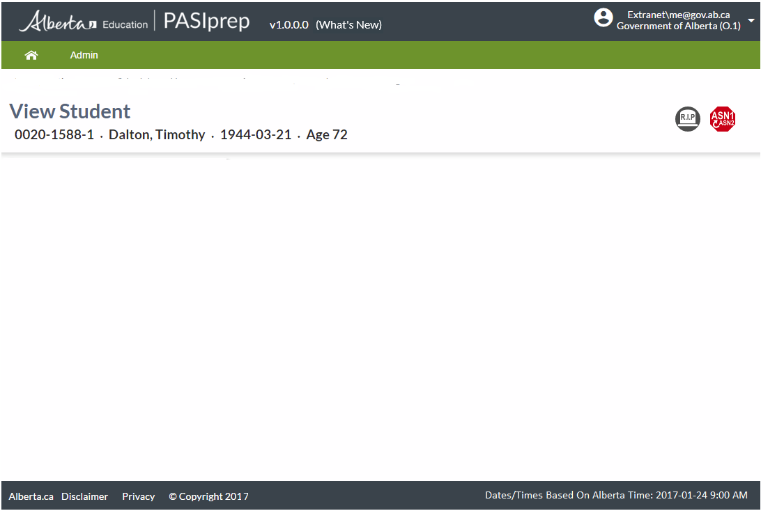
When displaying information that is tied to a single student, the subtitle area will be the Student Identifier Subtitle.
The Student Identifier Subtitle includes (from left to right): {ASN} · {Student's preferred name} · {Student's birthdate} · Age {Student's age}
- Docked to the right in the Student Identifier Subtitle are any Student Status Badges applicable to the student
- The student's name should be truncated to a max of 60 characters as needed (as per the Name Data Format Guidelines)
- The ASN and Student's name are rendered as links to the corresponding View Student page
- The Student Identifier Subtitle is only available when the user has Access to the Student (Moved)
Actions Toolbox
The Actions Toolbox lists the functionality the user can perform on the data/object the user is currently viewing.

The following frequently used actions are presented as buttons, which includes:
- Edit
- Delete/Undelete
- Cancel
- Save (should be displayed as Raised button)
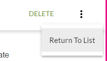
For other actions, they are to be included in the “more” dropdown menu. This allows for more descriptive names to be used, as well as consistency only presenting frequent actions as button.
User can click/tap on the option menu to see the list of options.

Message Panels
Message Panel for Errors and Warnings
Used for displaying errors and warning messages that generally result from an action performed by the user.
An optional Message Panel is anchored below the Page Title Header to show Errors and Warning messages that are applicable to the an action the user just performed on screens.
- Error messages should be displayed in red. They should dock along with the Page Title Header when the user scrolls down on the page.
- Warnings should be displayed in yellow / bronze
Message Panel for Cautionary and Informational Messages
For cautions/informational messages (that are “For Your Information” type messages that users needs to be aware of before performing/completing an action), a full-width message panel can be incorporated as part of the content. The location of these panels should be defined in the design as they can be incorporated inline with the content.
- These panels should be displayed with a light blue background
- “Caution” type information should be displayed with an exclamation mark icon
- Informational messages should be displayed with an info (i) icon.
Footer
The footer is displayed at the bottom of the page below all the content and it mimics the footer on the Alberta Education public website:
- Clicking/tapping on:
- The Alberta Education logo goes to: http://alberta.ca
- Disclaimer goes to: https://education.alberta.ca/using-this-site/copyright-disclaimer/
- Privacy goes to: https://education.alberta.ca/using-this-site/privacy/
- The Alberta Education logo goes to: http://alberta.ca
- (C) Copyright 2017 - Shows the server name in a tooltip
In addition, an informational message is displayed on the right side of the footer clarifying that all dates and times displayed are based on Alberta dates and times.
Loading Indicator
Whenever the UI is actively interacting with the server, a toast popup with a loading indicator will be shown to the user. This will disappear once the server operation is complete.

See PASIprep Long Running Request Guidelines for definition on the types of operations.
There are two types of indicators:
| Determinate | This should be used where the percentage of the operation completed can be determined (e.g. operations performed in chunks). Here, the progress bar moves from 0% to 100% to show the operation's progress. |
|---|---|
| Indeterminate | This is used where we do not know when the operation will finish. Here, the progress bar cycles from 0% to 100% quickly. |
- If there are multiple operations at any given time, only a single operation will be shown. Prioritization is given to determinate indicators that have the highest percentage complete.
- If the operation is cancellable, a [X] function link will be docked to the right of the corresponding message on the indicator. If the user clicks on it, the operation should be cancelled.
The indicator will have a message that describes the operation:
- For Submission type operations, “Saving {business object}(s)” should be used as the message
- e.g. “Saving work item(s)”, “Saving student legal name(s)”.
- For Retrieval singular type operations, “Loading {business object}(s)” should be used as the message.
- e.g. “Loading work item(s)”, “Loading student legal name(s)”
- For Retrieval bulk type operations, “Loading list of {business object}(s)” should be used as the message.
- e.g. “Loading list of work item(s)”
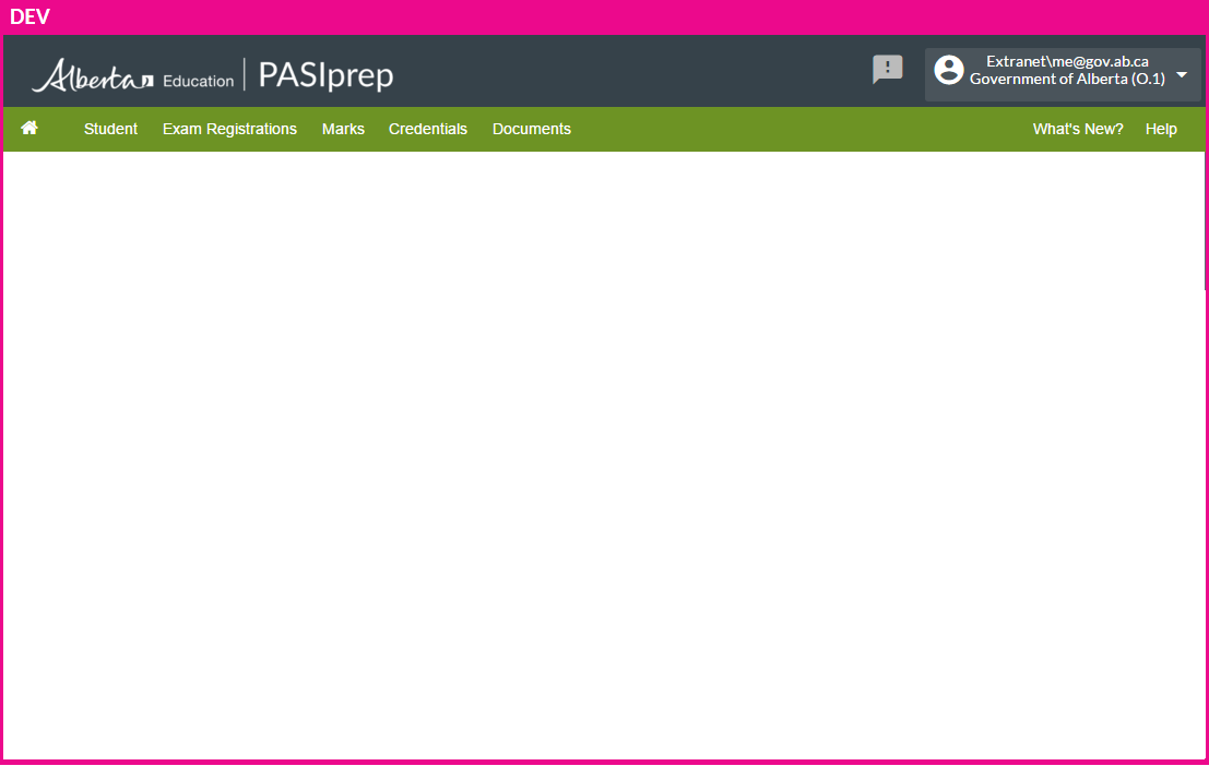
Environment Indicator
For non-production environment, a border will be displayed around the entire page to indicate it is a non-production environment. The name of the Environment is displayed on the top border.
Page Content
The white area below the Page Title Header is the main content area.
Unless there is an exceptional case, content on each page of PASIprep should follow one of the following Page Content Templates:
Dividing Page Content into Sections
Page content can be split into sections to provide visual / logical breaks for the user.
- Each section should have a title.
- By default it should be displayed in heading 3 font. The font should decrease in heading level if it is a child section of a parent section.
- Note that some UI Patterns/Widgets may also have its own defined method of breaking content into groups/sections (e.g. Value List where a list of Value Pairs can be split into multiple groups).


