User Tools
- Logged in as: PASI Exporter (exporter)
- Update Profile
- Log Out
Table of Contents
myPass Screen Layout Guidelines
Current GOA Standards
The following site contains the current standard for GoA sites: http://webtemplates.alberta.ca/ or http://www.psc.alberta.ca/orientation/readme/index.html
One large limitation of this template is that it is not built as a responsive site.
Cross Government Internet Committee (CGIC)
This share point site contains information and some discussions around the GOA standards. It is not clear how relevant the site is but there does seem to be some information that could be useful.
The site is located here: https://saportal.gov.ab.ca/sites/webnstuff/cgic/wiki/Wiki%20Pages/Web%20standards.aspx
myTradeSecrets
The PASI team does not have an official updated look and feel design from the Public Affairs Bureau. EAE has some preliminary guidance and implemented a few sites using the GOA template.
The site is located here: http://tradesecrets.alberta.ca/MyTradesecrets/ They have modified it so that their sites are implemented using responsive design.
GoA Identity Manual
A copy of the GoA Corporate Identity Manual can be found here: http://engage/pasi/team/Team%20Documents/BA%20Team/Alberta_Corporate_Identity_Manual.pdf
GoA logos and colour palette can be found in the manual; however, the manual is specific to print media, and not digital media.
Standard Layouts for Public
Page Header (Large Resolution)
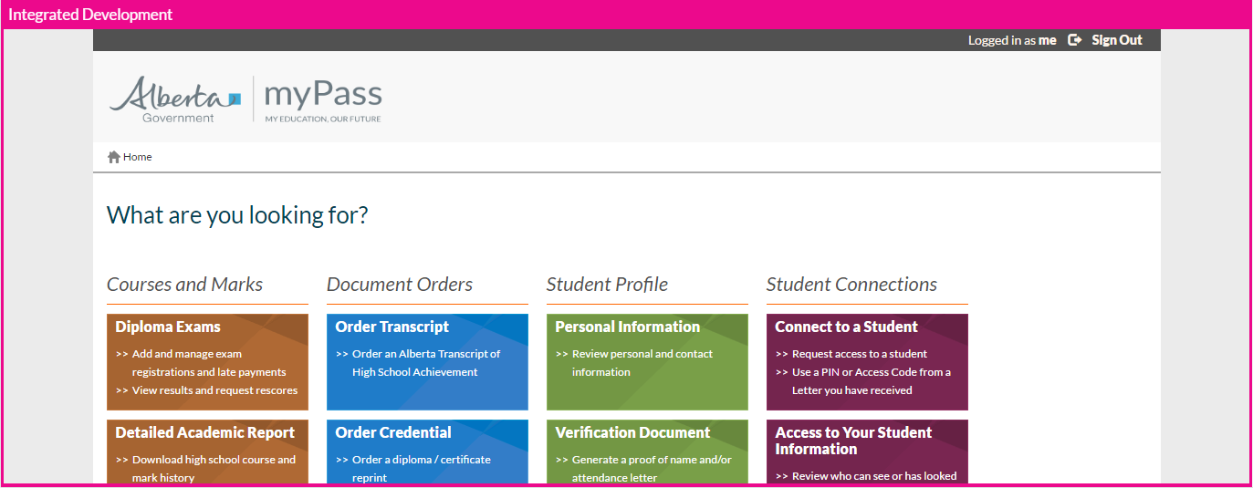
This mockup shows the header layout that will appear on all the myPass pages on a large resolution.
User can click [Sign Out] to log out of their Education Account and return them to the myPass Welcome Page for that environment.
Clicking on the [Logged in as {Web Guard User Name}] link takes user to the My Account page of their Education account.
Clicking the “FR” icon will:
- set the user's preferred language to French
- toggles the icon to “EN”
- refresh the page with the content displayed in French.
Clicking the “EN” icon will:
- set the user's preferred language to English
- toggles the icon to “FR”
- refresh the page with the content displayed in English.
A breadcrumb trail is displayed below the logo. [Home] will always be visible and be at the root; other pages will display the trail based on how many level it is away from the root. Below is an example of a page that’s one level down from the root
User can always return to a level by clicking on which level they would like to return to on the breadcrumb; however, the last level, i.e. the level the user is currently on, would not be clickable as user is already on that page).
User can always return to the Home page by clicking on the Alberta logo on the header or the [Home] link in the breadcrumb.
Note that breadcrumbs are designed for pages that falls in the site’s “Normal” hierarchy; error pages and ‘standalone’ pages (i.e. pages that is not a part of the expected workflow for the user) generally will just have a [Home] root breadcrumb, as they do not fall in a specific location in a hierarchy.
The [Messages] link highlights the number of unread myPass message the user has to read and when selected, will take the user to the myPass Messages screen.
Page Header (Small Resolution)
These mockups show the header layouts that will appear on all the myPass pages on a smaller resolution.
On small resolution, the breadcrumb is reduced to just show the previous level so that user can return to the previous level by clicking on it. If user is at the root (Home), the breadcrumb will not be visible.
Page Footer (Large Resolution)
These mockups show the footer layouts that will appear on all the myPass pages on large resolution. This footer will appear in all pages:
- The links in the footer are: Copyright and Disclaimer - Link and Privacy - Link
- Note: The year in the “© 2007-2014 Government of Alberta” message in the footer mockup should show the current year instead of the year range. This should be computed dynamically using the current date.
Page Footer (Small Resolution)
Page Content Template (Large Resolution)
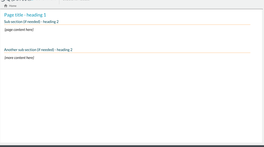
This mockup shows a general page template. Page content sits between the breadcrumb in the header and the page footer.
Page content should be preceded with a page title, and divided into subsections as needed.
Page Content Template (Small Resolution)
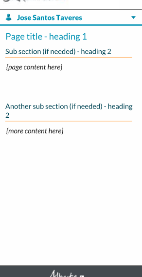
The small resolution template is identical to the large resolution counterpart; Page title and section titles should wrap as needed.
Page Content Template with Student Connection Selector (Large Resolution)
When a page’s content changes depending on a selected Student Connection, a Student Connection Selector is presented on the page to allow user to switch between different Student Connections.
The Selector sits below the breadcrumb and above all page content. Clicking on the selector reveals the list of preferred names of the students for which student connections are available (self-connection is always listed first; all other connections are listed from A-Z by name).
For more information see the Student Selector control.
Page Content Template with Student Connection Selector (Small Resolution)
This mockup shows the Student Connection Selector in small resolution:
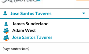
Clicking on the selector opens an overlay menu that shows all the options available:
Aside from the changes in behavior and appearance, the selector functions the same as the large resolution.
Standard Layouts for Administrative mode (myPass Admin)
When a PASI user accesses myPass through PASIprep and user has the proper permissions to view unconnected Student in myPass, the site operates in Administrative Mode – aka “myPass Admin”. In this mode, the branding in the page header is changed to indicate to user that they are in Administrative Mode (Large and small resolution mockups shown below).
The Student user wishes to view is automatically added to the Student Connection Selector (when visible on screen) with the Student Preview icon, and it is the only option available in the selector.
Aside from branding and the changes to the Student Connection Selector, all content and functions remains identical to the Public myPass interface (unless otherwise stated in specific design documents).
Error / Message placements
Error / Message Placement (Large resolution)
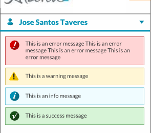
These screen shots illustrate the layout of the message panels (error, warning, info, success). They will appear just below the breadcrumb (and above the student connection selector if it is visible), docked to the top of the page content.
Ensure user can see these messages when they appear (e.g. in an AJAX form where the page does not refresh and user has scrolled far below the header, they should be automatically scrolled back to the header message area if the message is important to them)
Each message box will appear only when there is message to show. The message text will wrap and the height of the message box will vary depending on the length of the message. If there are multiple types of messages (e.g. an error and an info message that needs to be displayed to user), it should be sorted in the order shown above.
Error / Message Placement (Small Resolution)
This screen shot illustrates the placement of messages on small resolutions, which is identical to the large resolution counterpart. The message text will wrap as needed.
Environment Indicator
|
mypass_screen_layout_guidelines.txt · Last modified: 2019-05-29 08:43 by bryon
|


